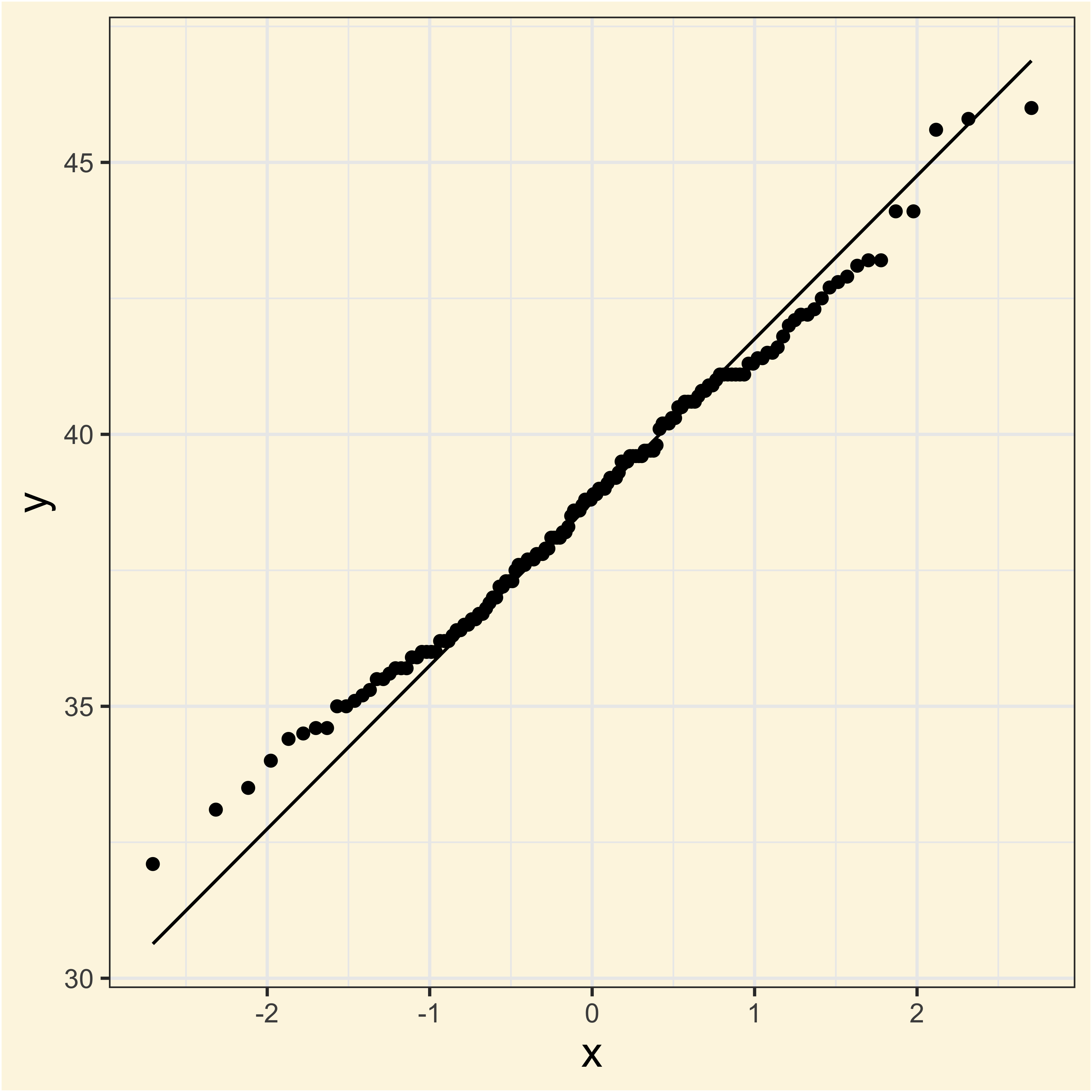
ggplot(adelie, aes(sample = bill_length_mm)) +
    geom_qq() +
geom_qq_line()Normality and Transformations
https://bit.ly/41MCWbv
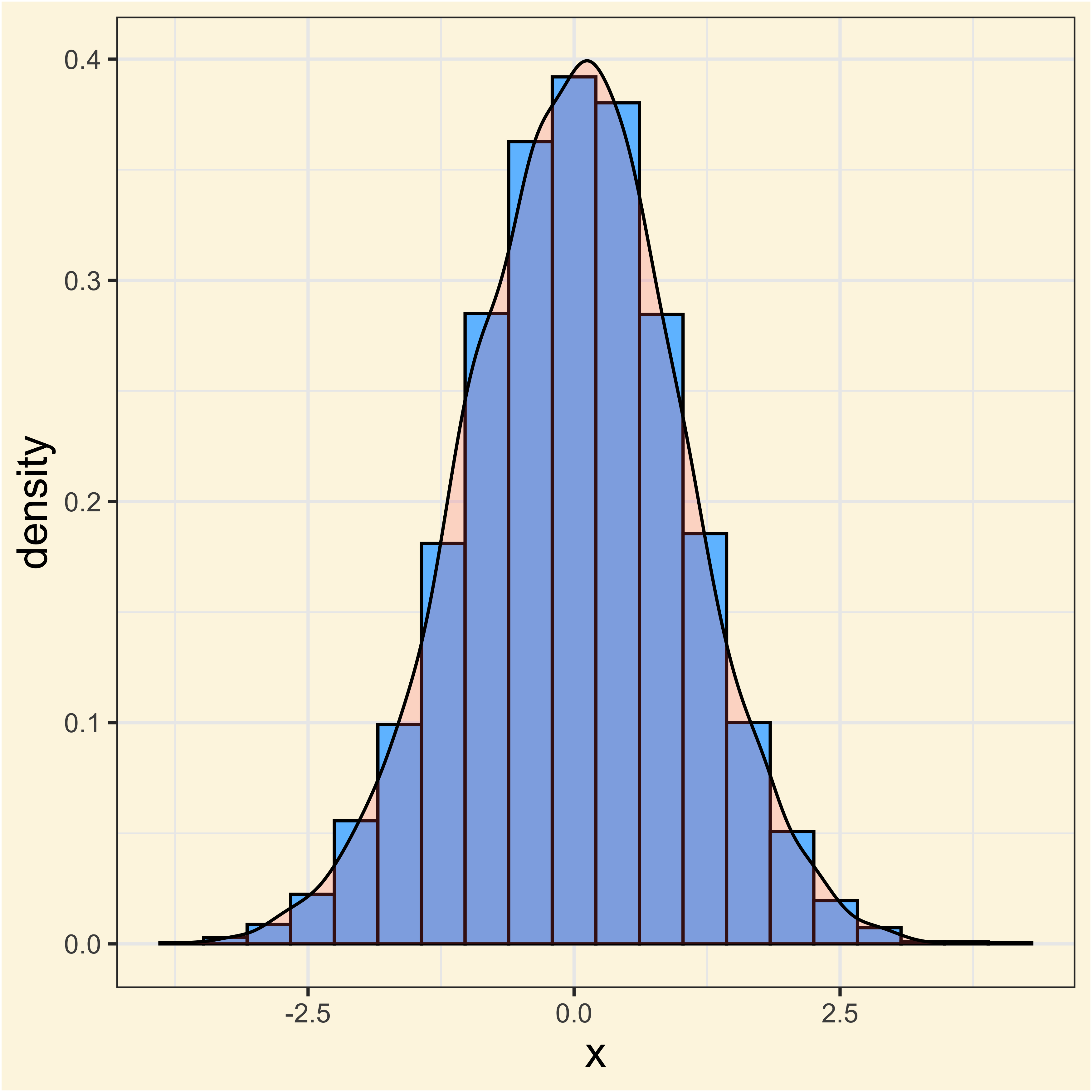
What is normality?
When the frequencies of a random variable \(X\) cluster around a central value, it is said that it follows a normal distribution.
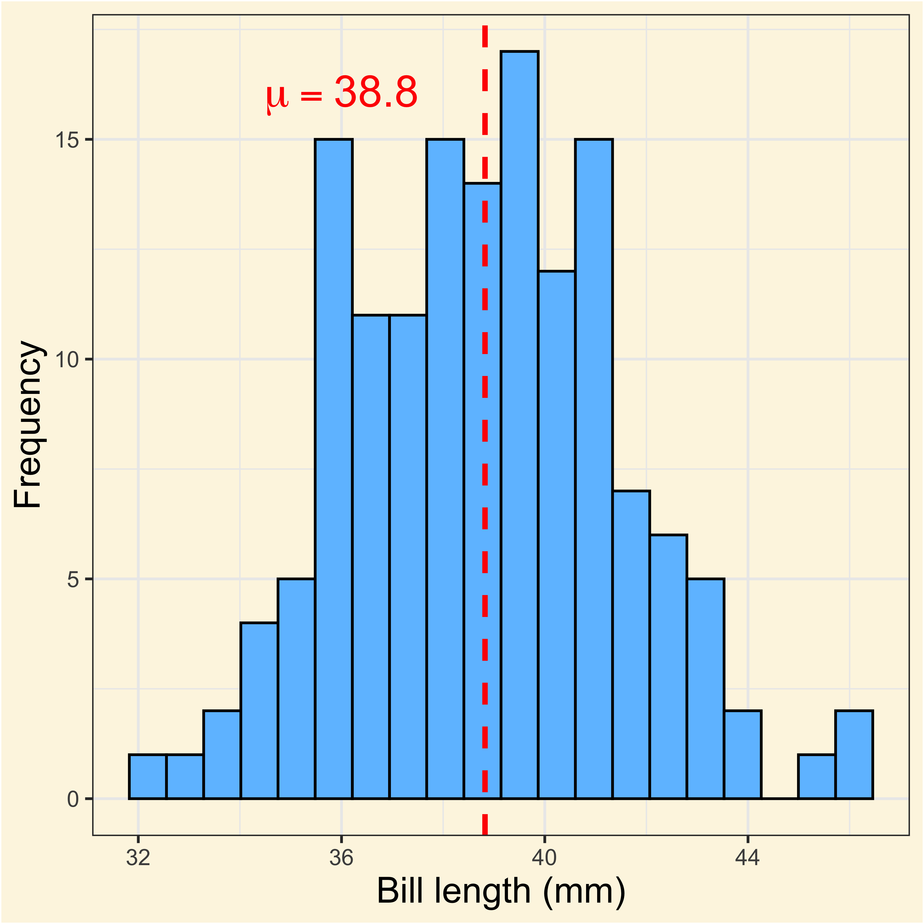
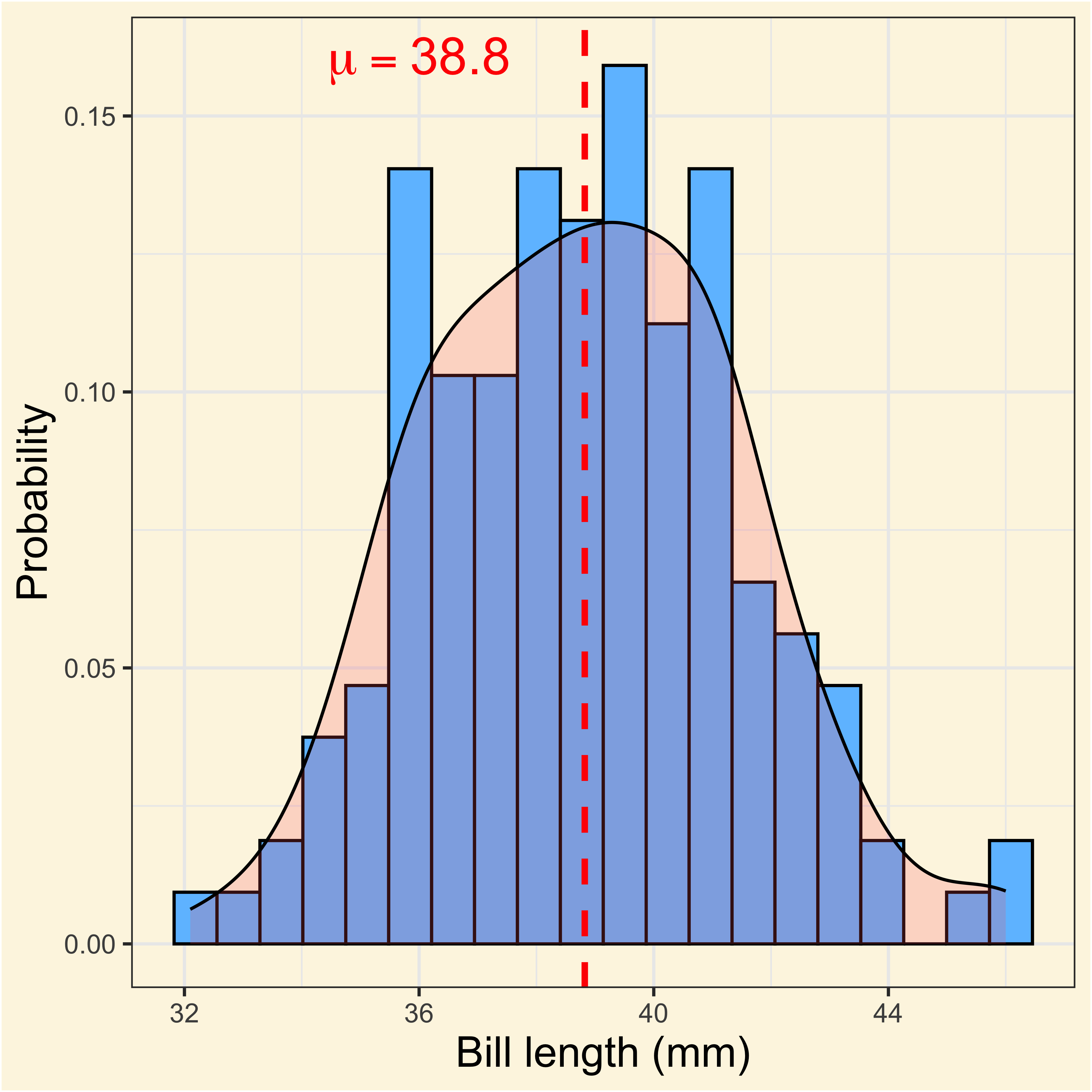
The Q-Q plot
Is my data really normal? Let’s see the quntile-quantile (Q-Q) plot:
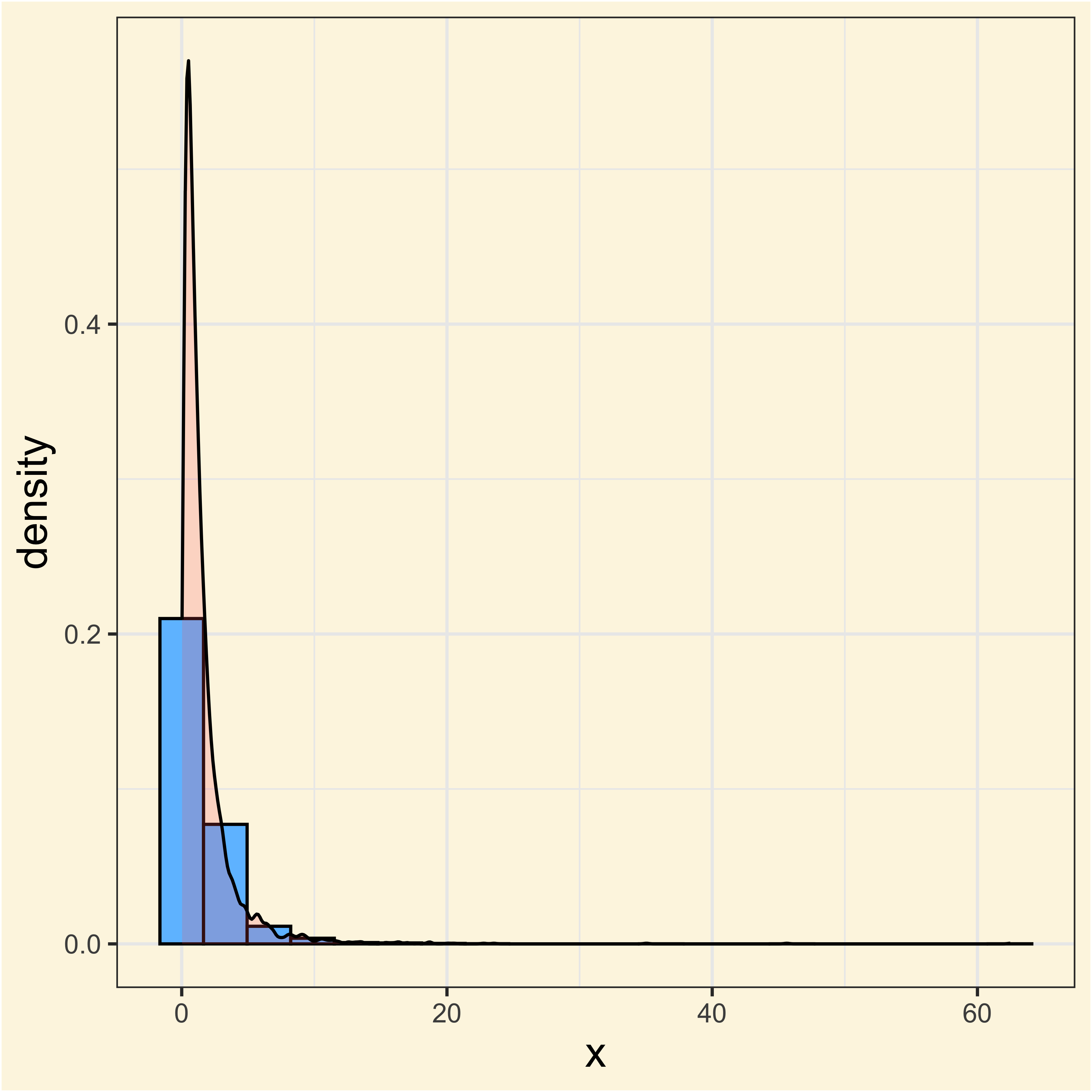
The Log-Normal distribution
By applying a log transformation to a log-normal distribution, we can go back to a normal distribution
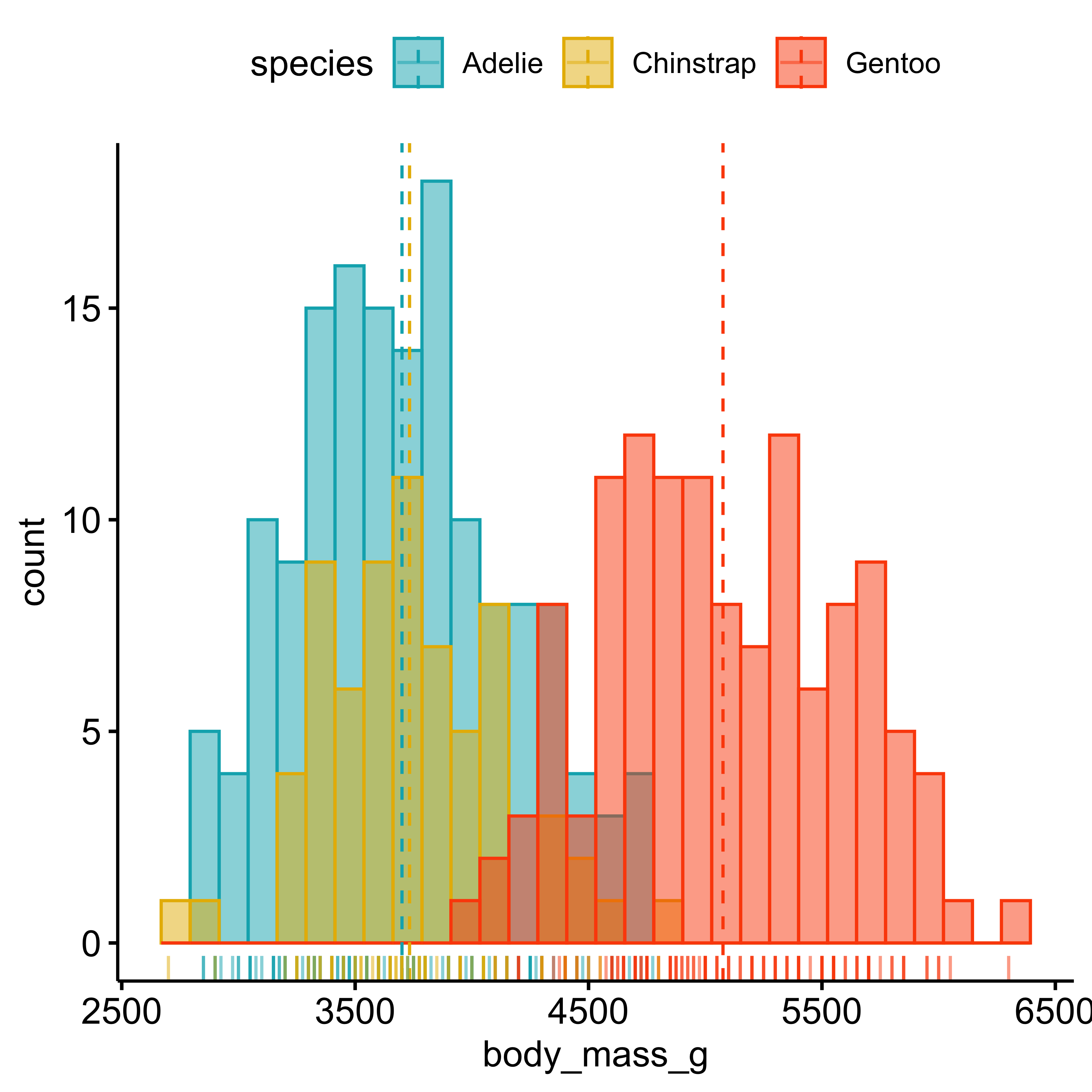
Histograms
gghistogram(penguins,
    x = "body_mass_g",
    add = "mean",
    rug = TRUE,
    color = "species",
    fill = "species",
    palette = c(
        "#00AFBB",
        "#E7B800",
        "#FC4E07"
    )
)